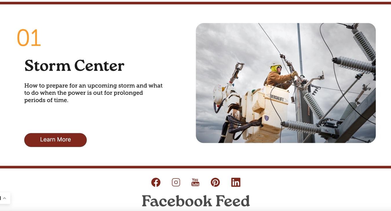
Less is More
The Power of Negative Space
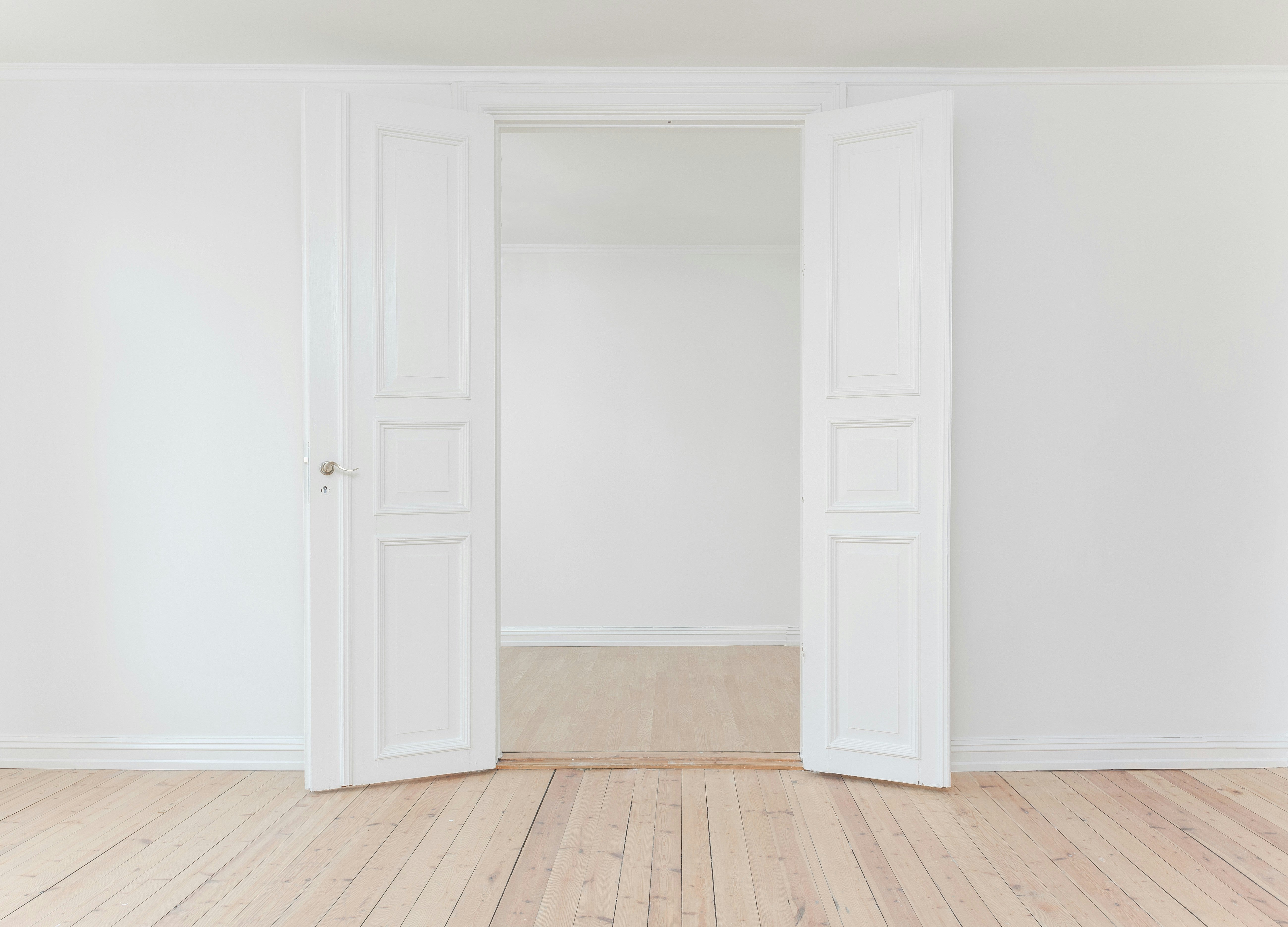
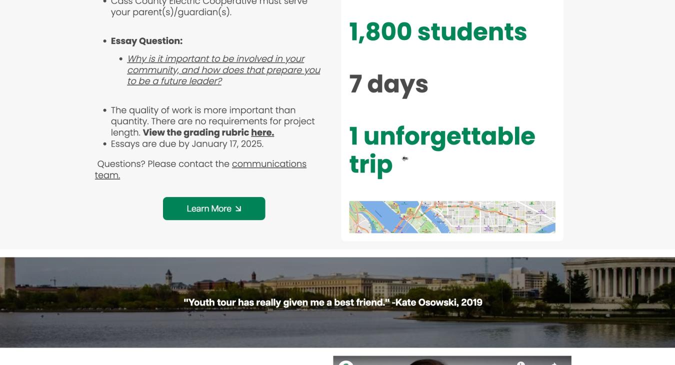
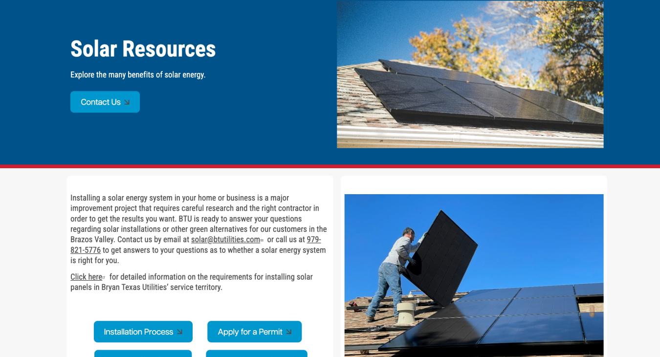
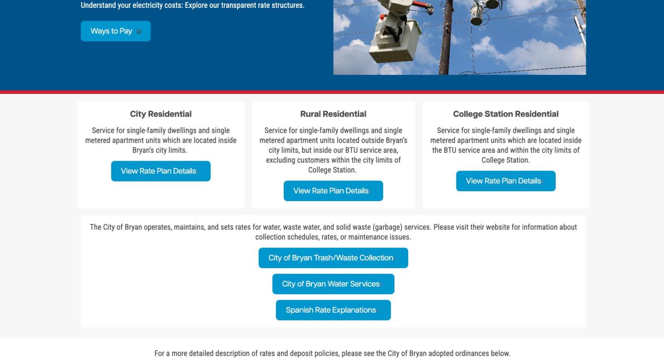
Just as a clean, uncluttered office can boost productivity and clarity, negative space in web design creates a visually appealing and user-friendly experience.
Think of negative space as breathing room for your website's stars: the text, images, and buttons. Ample margins, padding, and background colors keep them from feeling crowded, making them stand out and improving readability.
Here's the magic: negative space isn't just about emptiness. It's about guiding the user's eye. By prioritizing information hierarchy through different font sizes, call to action button placement, and negative space...you can create a natural flow for visitors to navigate your content effectively.
The result? A user experience that's intuitive, aesthetically pleasing, and reduces distractions. Think of the way your mind perceives Apple.com – simplicity, calming, soothing, and direct navigation come to my mind.
Negative Space in SHiNE CMS
By effectively utilizing text, images, and buttons within SHiNE CMS, you can harness the power of negative space to create clean, visually appealing, and user-friendly websites. The new page layout creator boasts an impressive feature called Styles, which will allow you to create negative space with ease.
With the addition of the Styles, our members can now effortlessly implement negative space principles. By adjusting margins, padding, background colors, and even background images, you will:
- Highlight key elements: Draw attention to important content by providing ample breathing room.
- Improve readability: Enhance text legibility through strategic spacing.
- Create a sense of balance: Achieve a harmonious layout by distributing elements evenly.
- Elevate the overall aesthetic: Foster a clean and modern design.
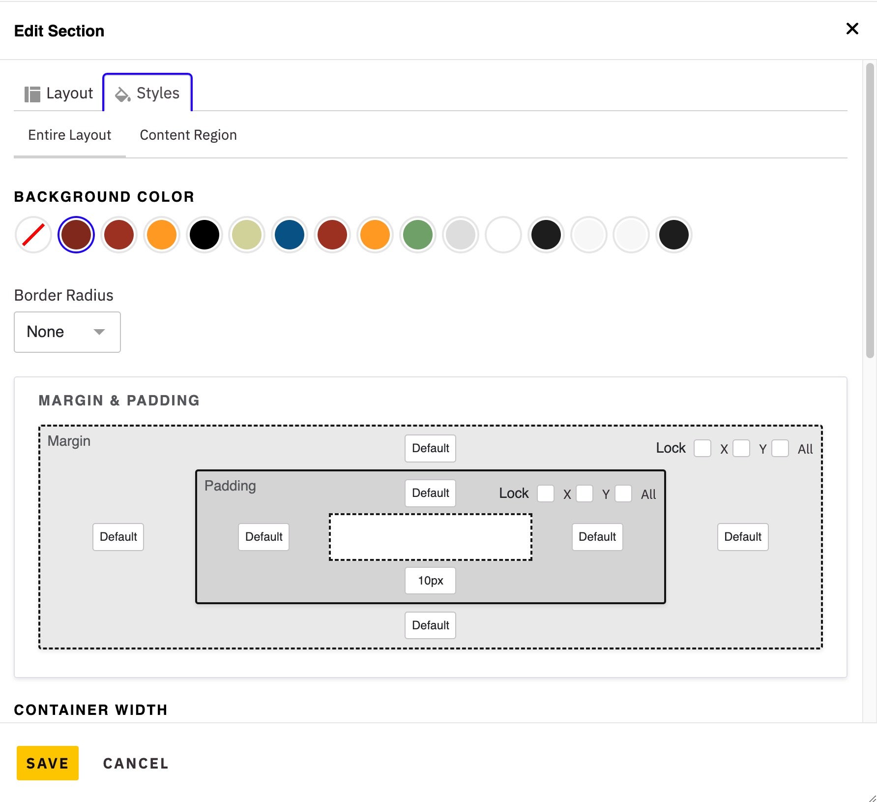
By mastering the art of negative space, you can elevate your SHiNE CMS websites to new heights.
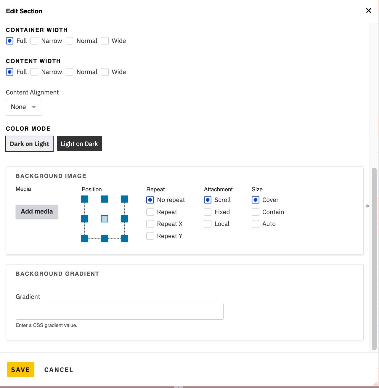
Styles also includes settings to change your Container Width, Content Width, Content Alignment, Dark/Light Color Mode, Background Images, and even the Background Gradient for any area of your entire website. The width settings will help you control what content goes full-width or is pushed more narrowly towards into the center of the page.
The Organic Evolution of Web Design
Organic shapes, with their soft curves and asymmetrical lines, are adding a touch of elegance and dynamism to modern web design. Inspired by nature, these flowing forms can be used to:
- Break up sections: Add visual interest without harsh lines.
- Create unique backgrounds: Consider using a gentle hill shape to separate content blocks or a swirling pattern to accentuate a key message. Use a generator to create shapes for your website (https://www.softr.io/tools/svg-shape-generator).
- Generate SVG shapes: Create and export shapes for your Section backgrounds in seconds. Try a shape generator like (https://www.shapedivider.app/) to create angled, curved, triangle, and many more background patterns.
By incorporating organic shapes into your cooperative's website design, you can create a more visually appealing and engaging user experience that reflects your organization's values and mission. Organic shapes can also help to convey a sense of visual harmony. If you are having trouble finding shapes to use for your background, give SVG Backgrounds a try (svgbackgrounds.com). To see an example of a organic shape in-action, check out the laptop with the Crow Wing Power website image on the homepage of https://www.shine.coop/.
Elevate Your SHiNE CMS Designs with Organic Shapes and Negative Space
SHiNE CMS offers a versatile platform to bring your creative vision to life. By leveraging the robust background image settings within the Styles feature, you can easily incorporate organic shapes and negative space to create visually appealing and cooperative-focused designs.
Here's how to use this feature:
- Choose Your Shape:
- Select an organic shape that aligns with your cooperative's brand and message. Consider soft curves, flowing lines, or natural patterns.
- Set the Background Image:
- Upload your chosen shape as a background image for a specific Section or make that Section the entire page.
- Adjust the Position:
- Experiment with different positions to achieve the desired effect. Center the image, place it in the background, or use parallax scrolling for a dynamic look.
- Control the Behavior:
- Determine how the image should behave:
- Repeat: Tile the image to create a seamless pattern.
- Cover: Scale the image to fill the entire background, potentially cropping it.
- Contain: Scale the image to fit within the background, preserving its aspect ratio.
- Scroll: Allow the image to scroll behind the content as the user scrolls.
- Determine how the image should behave:
Why Organic Shapes and Negative Space Matter:
- Enhanced Visual Appeal: Organic shapes add a touch of nature and elegance to your design.
- Improved Readability: Negative space creates a clean and uncluttered layout, making content easier to read.
- Stronger Brand Identity: A visually appealing website reinforces your cooperative's brand and values.
- User-Friendly Experience: A well-designed website with clear navigation and easy-to-read content enhances user satisfaction.
By mastering these techniques, you can create stunning websites that reflect your cooperative's commitment to sustainability, community, and innovation.
Full-Height Homepage Hero
The Power of Storytelling
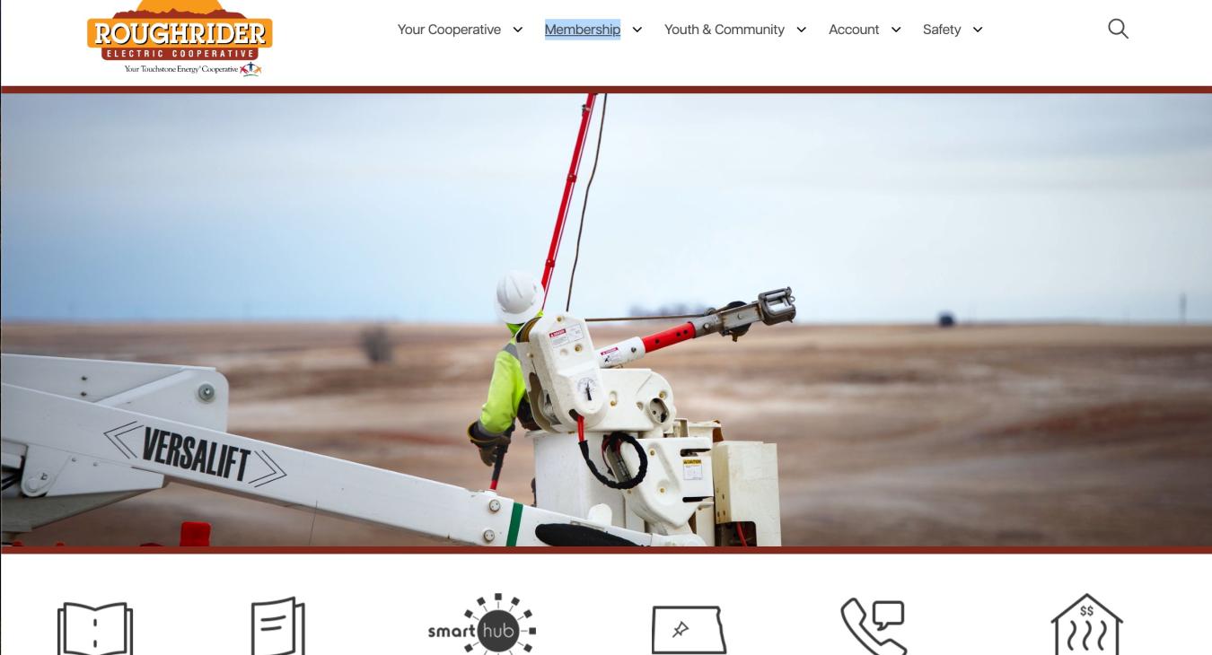
Full-screen hero sections provide the perfect canvas for storytelling. However, keep in mind that images may crop differently across various devices and screen sizes. Choose images that adapt gracefully to different dimensions, and do not use images that include text layers.
While traditionally, content above the fold was paramount, today's users are accustomed to scrolling. Don't hesitate to leverage the full potential of your homepage, even if it means scrolling to reveal more.
Leveraging the Full-Page Hero in SHiNE CMS
SHiNE CMS provides a powerful tool for creating impactful first impressions: the full-page hero banner. This versatile feature allows you to:
- Capture Attention: Immediately engage visitors with a visually stunning, full-screen image or video.
- Highlight Key Messages: Clearly communicate your cooperative's mission, values, or special promotions.
- Drive Action: Encourage visitors to take specific actions through compelling calls to action.
- Showcase Seasonal or Time-Sensitive Content: Easily update the hero banner to reflect current events or campaigns.
How to Customize Your Hero Banner:
- Choose Your Media: Select a high-quality image, vector artwork or video that aligns with your message.
- Set the Tone: Use a strong, clear headline to grab attention.
- Call to Action: Encourage visitors to take the desired action with a prominent button.
- Background Options: Experiment with different background colors, images, or videos to create the perfect ambiance.
By effectively utilizing the full-page hero banner, you can elevate your SHiNE CMS website and make a lasting impression on your audience.
Browse our stellar co-op SHiNE website examples below.
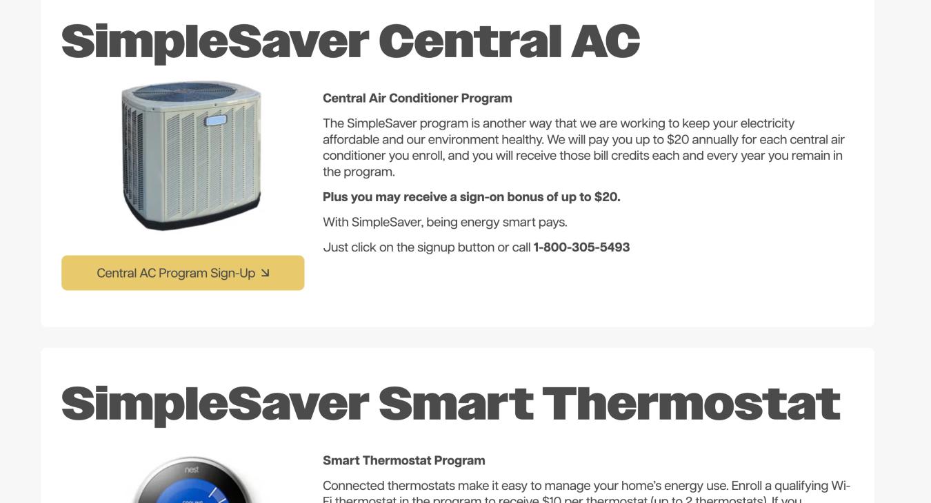
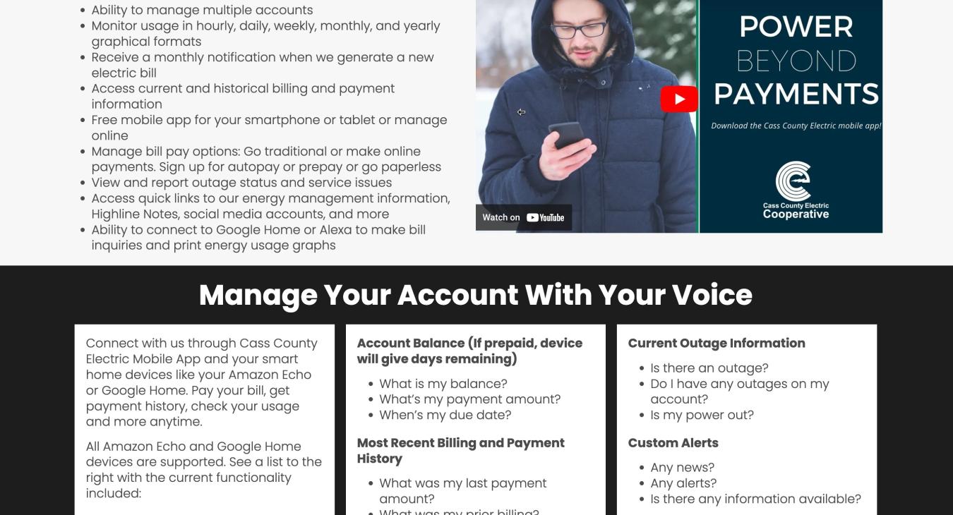
Co-op Negative Space Examples
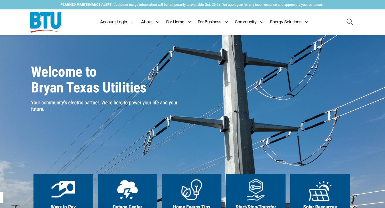
Bryan Texas Utilities - Homepage
- Log in to post comments

