As we approach 2025, it's fascinating to consider the evolving landscape of web design. With advancements like AI and sophisticated chatbots hold immense potential, I believe we'll witness a return to core principles: navigation, accessibility, sustainability, and a focus on authenticity of the human connection.
Just as fashion and music often revisit past eras, I predict a resurgence of clean, minimalist designs. Expect to see a shift towards more intuitive user experiences, prioritizing clarity and ease of navigation, aiming to improve the experience of a website as a whole design system.
In 2025, we'll see a greater emphasis on:
- Navigation: Prioritizing user needs and creating websites that are easy to understand and navigate.
- Accessibility: Improve the time it takes to digest information by improving color choices and typography usage.
- Sustainability: Designing websites with environmental impact in mind, prioritizing efficiency and minimizing resource consumption.
- Authenticity: Embracing a more genuine and human approach to online communication.
Let's dive into the details of the 4 core principles of design for 2025 and see if you agree with us!
Navigation
Make sure your main menu links are concise, well written, and that you don't have more than 4-6 links at the top level. An easy to digest navigation and mobile menu experience makes up for a large chunk of your website's readability. Make sure to verify your main menu works great on tablets and mobile devices as well.
Create a clean and clear layout for your website top level navigation, main menu navigation, and footer navigation elements.
Best in Class: Let's take a look at a few electric cooperative websites that dominate in the easy to use navigation category.
Cobb EMC - For a beautiful, easy to digest, main navigation menu and layout.
BTU - For a simple, category based, easy to use navigation main menu layout that has 3 breakpoints to thrive on desktop/tablet and mobile.
High West Energy - For a more traditional menu with short simple verbiage that is very easy to use.
SHiNE Guidelines:
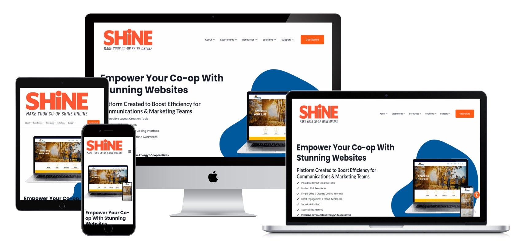
Use this free responsive website generator to see what your website looks like on 4 different devices. Make sure your navigation menu is visible on all screen sizes. And physically check with your phone to ensure your mobile menu is as effective (if not more so) than your desktop menu.

Accessibility
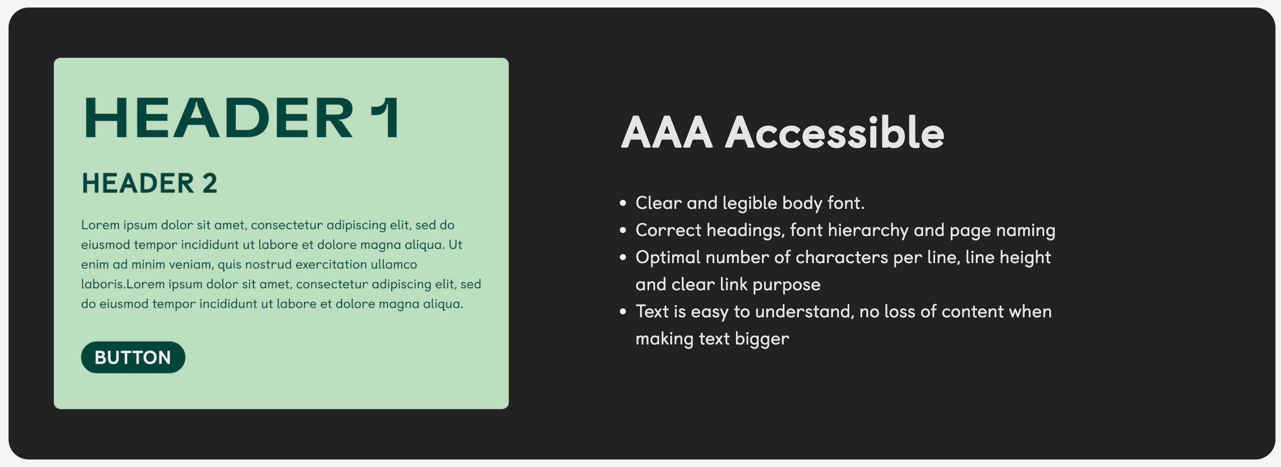
It is your duty to ensure not only members who have disabilities, but everyone can have an optimal experience on your website. Put the extra effort into your color palette selections and font (headings and body) appearance prior to building your website. Establish these key principles ahead of time, and watch your website usability and time on page metrics soar. Make sure the colors you choose speak to your brands identity and satisfy AA or AAA accessibility contrast guidelines.
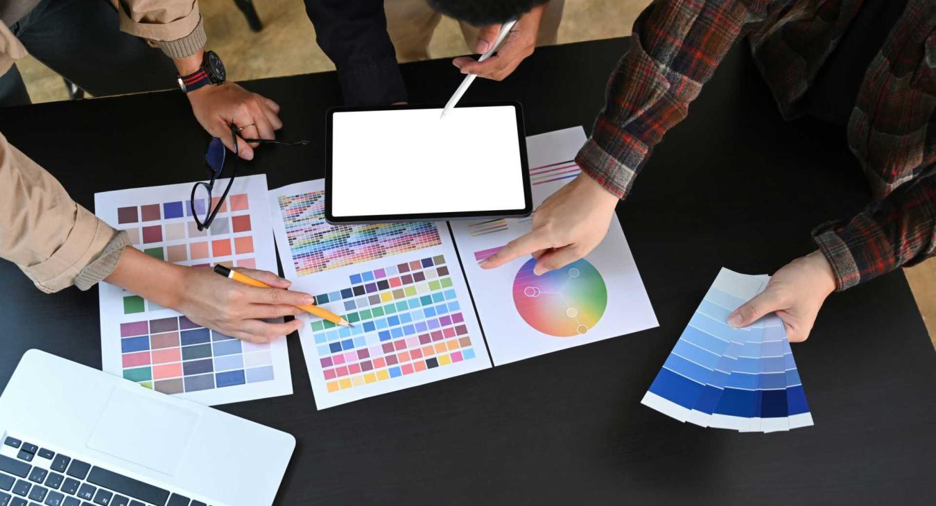
Color psychology explores the profound influence of color on human perception and behavior. It examines how different colors evoke specific emotions and can subtly influence our decisions.
By understanding these psychological effects, we can strategically incorporate color palettes into our design, marketing, and branding efforts. Instead of relying on personal preferences or fleeting trends, we can consciously select colors to evoke desired emotional responses in our audience.
For example, using calming blues to evoke trust or energizing reds to inspire action. By thoughtfully considering the psychological impact of color, we can create more effective and impactful designs that resonate deeply with our target audience.
Want to delve deeper into the fascinating world of color psychology and its design applications? Check out this informative resource: Color Psychology: A Guide for Designers, Marketers & Students.
Helpful Tools:
- Check your brand color choices to ensure they convey the right message to your members.
- Verify your color choices meet accessibility requirements by using this free online contract checking tool.
- Create your font pairing choice prior to building your new website.
SHiNE Guidelines:
- Select a clear and legible font pairing.
- Use Headings properly, they provide structure and hierarchy to your page content. Without these, your users with assistive needs are lost structurally, and unable to navigate your website with a keyboard or voice commands.
- Limit the number of characters per line, establish proper line height and text letter spacing.
- Use a tool that studies your writing to tell you how complex or easy it is to ready.

Sustainability
Accessibility is crucial for an inclusive and performant web, but the journey doesn't end there. 2025 is poised to see a rise in sustainable web design, focusing on minimizing your website's environmental impact. This means taking a holistic approach, optimizing design, code, navigation, and performance to achieve maximum effectiveness with minimal environmental cost.
The Web Sustainability Guidelines provide a valuable resource, offering 94 recommendations to help teams create digital products and services that are kinder to the planet. You can explore them in detail at the WC3 community group for Web Sustainability Guidelines.
For electric cooperatives, showcasing your commitment to green energy extends beyond design. The Green Web Foundation provides badges to recognize websites powered by renewable resources. Learn more and potentially earn your own badge at the Green Web Foundation website.
Best in Class:
The Touchstone Energy website (powered by SHiNE CMS) is a certified Green Hosting provider.

Authenticity
Consider different ways to use media to give your website more of a human connection and experience. We all remember being younger and ripping up magazines to create collages and then using glue to overlap images together and create more engaging experiences. Use this same mindset towards your website design, and try to incorporate something similar.
Let's take our standard hero region that uses a background photograph to enhance the visual connection to the site visitor. Sure, it's better than nothing, but we can do better!

Image you take the time to create a nice collage of your districts and representaatives, and include this collage that top of your District Map page?
This is how we are thinking you can improve your site design with more engaing and personal media. This example was taken from am amazing article in The Guardian.

Conclusion
By focusing on these core principles, we can create websites that are not only visually appealing but also functional, user-friendly, and meaningful. Also, we can do ALL of this without negatively impacting the flashiness or modern quality of our sites. Accessibility does not mean boring, it means doing the right thing to enhance the experience for all.
Overall, this shift towards a more human-centric approach reflects a growing desire for authenticity and connection in our increasingly digital world. As technology continues to evolve, we must remember the importance of human interaction and the power of accessible, simple, elegant design.
Read more articles
- Log in to post comments


